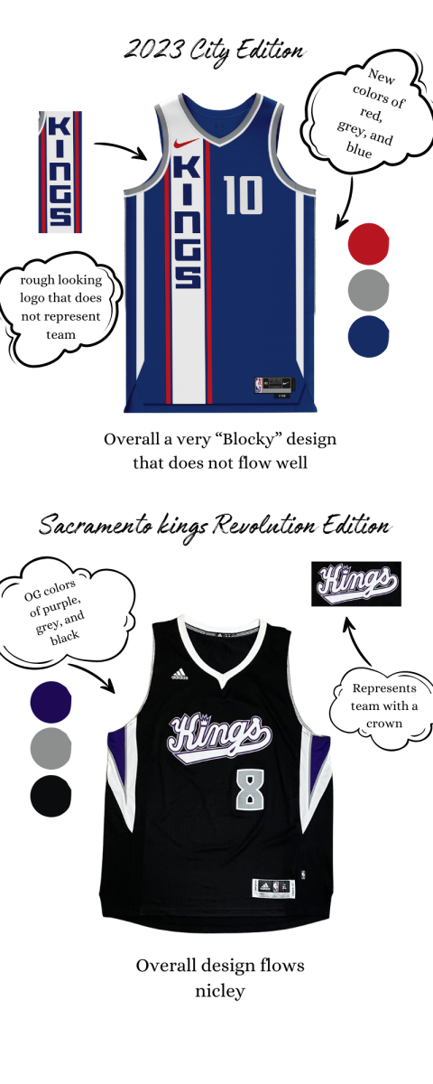
There has been a rising debate on how the new “city edition” NBA jerseys look for this year. Lately, based on a timeline of NBA jerseys, they have been getting worse. The jerseys represent the teams less, and they are straying away from original team colors.
“I think they have gotten a lot uglier because the NBA wants to modernize the uniforms,” sophomore Celeste Ogawa said.
“The newer city editions are for the teams and cities they represent, but they made them look a lot uglier, like some jerseys have gotten haywire.”
With this ongoing change in jerseys, avid NBA fans dislike how teams are straying from their traditional team colors, and implementing new colors that don’t associate with the team as much.
“When trying to modernize jerseys they should stick with their roots. I understand the need to modernize and go more minimalist, but making the jerseys ugly and random does not help,” Ogawa explained.
“An example being the “Sacramento Kings look horrible because they did not stick with the original colors, purple and gray. Blue, red and gray are their newer colors and overall more random,” she said.
Along with straying from traditional team colors, teams have made their jerseys a lot more simplistic, with designs that seem forced.
“I think they have gotten more ugly because they had more of a design and right now it’s just a color and their name,” sophomore Nick Yakubik said.
An example from this season is the Denver Nuggets city edition jersey. The Nuggets are famous for playing in a city that is 5280 feet above sea level. On their jersey, there is a distinct yellow “5280” towards the bottom of the jersey, with the players’ numbers in the top right of the jersey. This gives fans two numbers to look at, causing an eyesore.
While the jerseys have become a big talking point of the NBA for the last few months, it doesn’t overshadow the talent displayed on the court.
“I don’t think the jerseys have affected my views, they still play well despite their new jerseys,” Ogawa added.
